
|
|
|
|
|
 |
|
Navigation |
|
>> Home |
"Fixing" the ASP.NET DataGrid
Written by: Alexander Zeitler The default DataGrid-WebControl shipping with the .NET-Framework already is a powerful control to display and edit data in table form. But when trying to implement the DataGrid in a fixed layout site the sizing behavior of the DataGrid becomes a problem: the number of rows and with it the height of the DataGrid may vary depending on the number of records to be displayed: 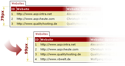
A not-so-perfect remedy would be to use the paging facility of the DataGrid - the aforementioned problem only shifts - mostly in inverted form - to the last page being displayed: 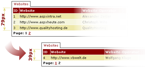
In order to solve the problem permanently, it is necessary to spruce up the DataGrid. And that's what we'll do in this article. Let's get startedSo far, we have seen more than enough of what we don't want to get, now let's see how the solution is intended to look like: 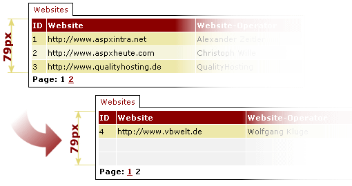
Given that the solution should be reusable, it is recommended to encapsulate it in a Web control derived from the DataGrid. The new control is located in the class FixedHeightGrid, the source code in the appropriately named file FixedHeightGrid.cs. As mentioned before, our new class is derived from the DataGrid that is part of the WebControls-Collection of the .NET-Framework. Code-wise this looks as follows: public class FixedHeightGrid : System.Web.UI.WebControls.DataGrid The colon tells our class that it should inherit all properties, methods and events of the DataGrid class. The journey is the rewardThe basic methodology should be clear: we need a method which counts the number of existing elements - with or without paging - in the current view. The desired height is defined using the PageSize-Property already implemented in the DataGrid, which so far is used only when paging has been activated. Our method has to compare the number of returned rows with the maximum number of rows and append blank rows as necessary. Having defined implementation necessities, the question on how to actually implement it comes up. So far, the DataGrid has been a black box - now we need to peek inside. Before rendering is after renderingNo problem - as any object derived from the System.Web.UI.Control class, the DataGrid sports the protected OnPreRender method, which is called before rendering (= creation of the HTML code for the DataGrid object). At this stage the DataGrid is laid out in front of us in its entire beauty -in the form of objects, exactly that what we're looking for. Object orientationWe know that we want to insert rows, we know when to insert them, however, we still don't know where in the DataGrid to do it. In order to be able to answer this question we need to take a closer look at the layout of the DataGrid: 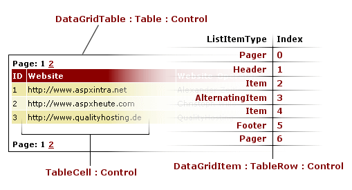
As we can see in the illustration, the DataGrid contains a table of type DataGridTable, which itself contains table rows of type DataGridItem. These represent a derivation of the more generic TableRow class, which equates to the HTML tag-combination <TR></TR>. The DataGridItems are used in different flavors such as Pager, Header, Item etc. The counterpart to the <TR></TR> tags HTML-wise are the <TD></TD> tags, which represent the innards of a table row. And as a matter of fact, the class TableCell wraps those. The figure also shows that the index of the controls is continuous, that is the index refers to the entire table (DataGridTable) of the DataGrid. You should absolutely avoid to mistake this index for the value returned by this.Items, which represents the number of records in the current view. To stick with the subject of mistakes and misunderstandings: the DataGrid allows to show or hide header and footer using ShowHeader = True/False or ShowFooter = True/False Both don't influence the index, that is the header and footer items are always created - no matter whether they are displayed or not. Completely different is the behavior of the pagers: they are generated depending on the value of the AllowPaging attribute, and thus affect the index based on whether shown or not. To round out the confusion, the pagers are not created depending on the attribute "PagerStyle-Position" (which could be "Top", "Bottom" or "TopAndBottom") but always in all styles. We therefore also need to take the behavior of pagers into account. Let's get ready for data!After this fact-gathering mission, we can now commence the realisation of our C# implementation. As mentioned earlier, our changes start in the OnPreRender method. Here we call our AddPaddingItems() method, which handles the blank row insertion (if necessary, that is).
protected override void OnPreRender(EventArgs e)
{
	AddPaddingItems();
}
In AddPaddingItems() first of all we declare some variables: int indexCount; int indexStop = this.PageSize; int indexStart = 1; The integer indexCount tracks the index of our DataGridTableItems. The integer indexStop contains the terminal value of our index and is initialized with the page size (the number of records to be displayed). The third variable is the integer indexStart, which stores after which index position the first ListItem appears. The latter two variables both depend on the aforementioned behavior of the pagers. If they are activated (AllowPaging=True), the start (=indexStart) and the end (=indexStop) have to be increased by 1:
if(this.AllowPaging==true)
{
	indexStart++;
	indexStop++;
}
Using a loop, we insert the new rows starting at the sum of start index plus the number of actual records:
Table myTable = (Table)this.Controls[0];
for(indexCount=indexStart+this.Items.Count; indexCount<=indexStop; indexCount++)
{
   myTable.Controls.AddAt(indexCount,PaddingItem());
}
The insertion is just a simple call to the AddAt() method, because mytable.Controls is a derived collection. The casting of this.Controls[0] to Table could be omitted, but for better readability I implemented it. The PaddingItem() method made an appearance in the previous listing. It returns a new DataGridItem, and it is as short as it's simple:
private DataGridItem PaddingItem()
{
	Table myTable = (Table)this.Controls[0];
	int numberOfColumns = myTable.Rows[1].Cells.Count;
    DataGridItem myItem = new DataGridItem(0, 0, ListItemType.Item);

    for(int indexCount=1; indexCount<=numberOfColumns; indexCount++)
	{
		TableCell myCell = new TableCell();
		myItem.Cells.Add(myCell);
	}
	return myItem;
}
Again, we first cast this.Controls[0] to Table. Then, we create a new DataGridItem of type ListItemType.Item (a standard item). The first two values in the constructor for the index of the item in the DataGrid and the DataSet index of the item are set to 0, because both values are not relevant respectively overwritten when being appended to the DataGrid. Next we create the necessary number of table cells in a loop, the number of necessary cells is obtained from number of columns in the header row (because this row is always created). When finished creating the cells, we return the DataGridItem to the caller - thus basically implementing the desired solution. New attributes to the peopleIn order to be able to format the inserted rows (PaddingItem(s)) correctly, we need a property which contains the CSS style definition for these rows:
private TableItemStyle _paddingItemStyle = new TableItemStyle();
public TableItemStyle PaddingItemStyle
{
	get
	{
		return _paddingItemStyle;
	}
	set
	{
		_paddingItemStyle = value;
	}
}
Even for this purpose the .NET-Framework offers an almost complete solution. We simply create a new object of type TableItemStyle, which stores a collection of CSS attributes. Because it is not going to be magically applied to our rows, we have to go back to our PaddingItem() method and modify it as follows:
if(this.PaddingItemStyle.CssClass != null)
{
   myItem.ApplyStyle(this.PaddingItemStyle);
}
return myItem;
We're checking whether a CSS class has been assigned to the PaddingItems. In this case, we apply the assigned PaddingItem style to the current PaddingItem using .ApplyStyle. If there is no CSS class assigned, the style definition of the standard item is automatically used, because we created an item of type ListItemType.Item. Another feature we'll implement is the ability to merge the table cells of the PaddingItems. This equates to the HTML attribute "ColSpan". Thus our class is extended by another property:
private bool _mergePaddingColumns;
public bool MergePaddingRows
{
	get
	{
		return _mergePaddingRows;
	}
	set
	{
		_mergePaddingRows = value;
	}
}
Also the PaddingItem() method is modified once again:
		int numberOfColumns = myTable.Rows[1].Cells.Count;
		if(this.MergePaddingColumns==true)
		{
			TableCell myCell = new TableCell();
			myCell.ColumnSpan = numberOfColumns;
			myItem.Cells.Add(myCell);
		}
		else
		{
			for(int indexCount=1;indexCount<=numberOfColumns;indexCount++)
			{
				TableCell myCell = new TableCell();
				myItem.Cells.Add(myCell);
			}
		}

		myitem.Cells.Add(mycell);
	}
}
First, we check whether merging of columns has been enabled. If so, we add only one table cell and set its - well known from HTML - property Columnspan to the number of columns of the heading row. Finally we append the cell to the new DataGridItem. The new DataGrid is now ready for use. But only, if we create the columns using AutoGenerateColumns. If we want to control the design of the columns using BoundColumn etc.we receive the following parser error:
The type learncontrols.BoundColumn in the Assembly learncontrols,
     Version=1.0.1339.22102, Culture=neutral, PublicKeyToken=null could not be loaded.
The reason for this is that we added the prefix "aspx" to BoundColumn. But in the assembly learncontrols (to which the TagPrefix aspx is assigned) there exists no definition for this class. But the remedy is easy: we just have to add derived classes of the column type classes to our assembly:
public class BoundColumn : System.Web.UI.WebControls.BoundColumn
{
}
With this final change we have reached the end of our short, but I hope interesting, journey to the world of developing controls using ASP.NET and C#. By the way, I almost forgot: the usage of the new DataGrid is shown in the files testfixedheightgrid.aspx and testfixedheightgrid.aspx.cs in the download for this article. ConclusionOf course, the solution shown in this article can be expanded on and I don't claim it to be complete. The DataGrid created today will be the matter of a further article, which explains the integration of the new DataGrid in the Visual Studio .NET IDE , because there is currently no IntelliSense available in the HTML editor for the DataGrid we created. Downloading the CodeClick here, to start the download.
©2000-2004 AspHeute.com |